Mr. Kartoshka is a story of how interior design becomes part of the city’s visual navigation. The
cafés are located in transportation hubs, railway stations, and near metro stops — places where the
rhythm of the city is most intense and attention must be captured in seconds. These spaces function
as visual beacons, standing out instantly within the urban flow.
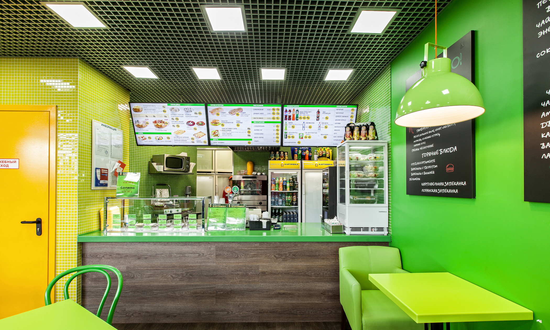
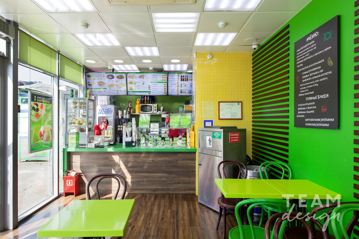
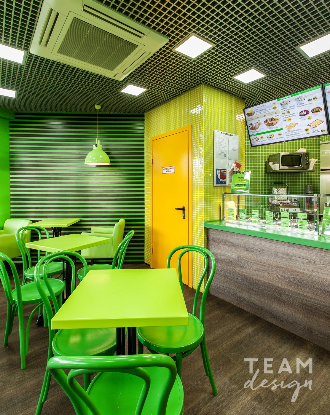
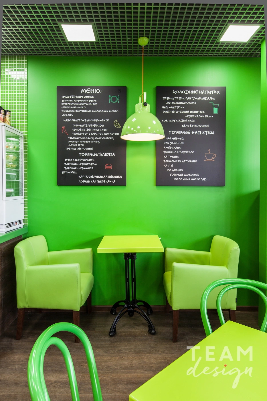
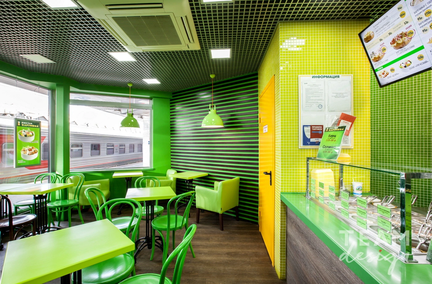
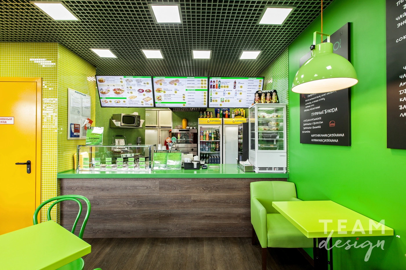
The interiors are built around an active color narrative: vibrant yellows and greens create an
energetic, fresh brand image associated with naturalness and lightness.
Graphic lines, contrasting surfaces, and an open spatial approach convey a sense of movement that
aligns with the fast-paced format of urban dining.
Materials were selected to withstand heavy traffic and constant use: durable finishes, practical
surfaces, and simple forms ensure longevity without sacrificing visual impact. As a result, each
café becomes more than just a place to eat — it becomes a vivid, accessible, and lively element of
the urban environment.